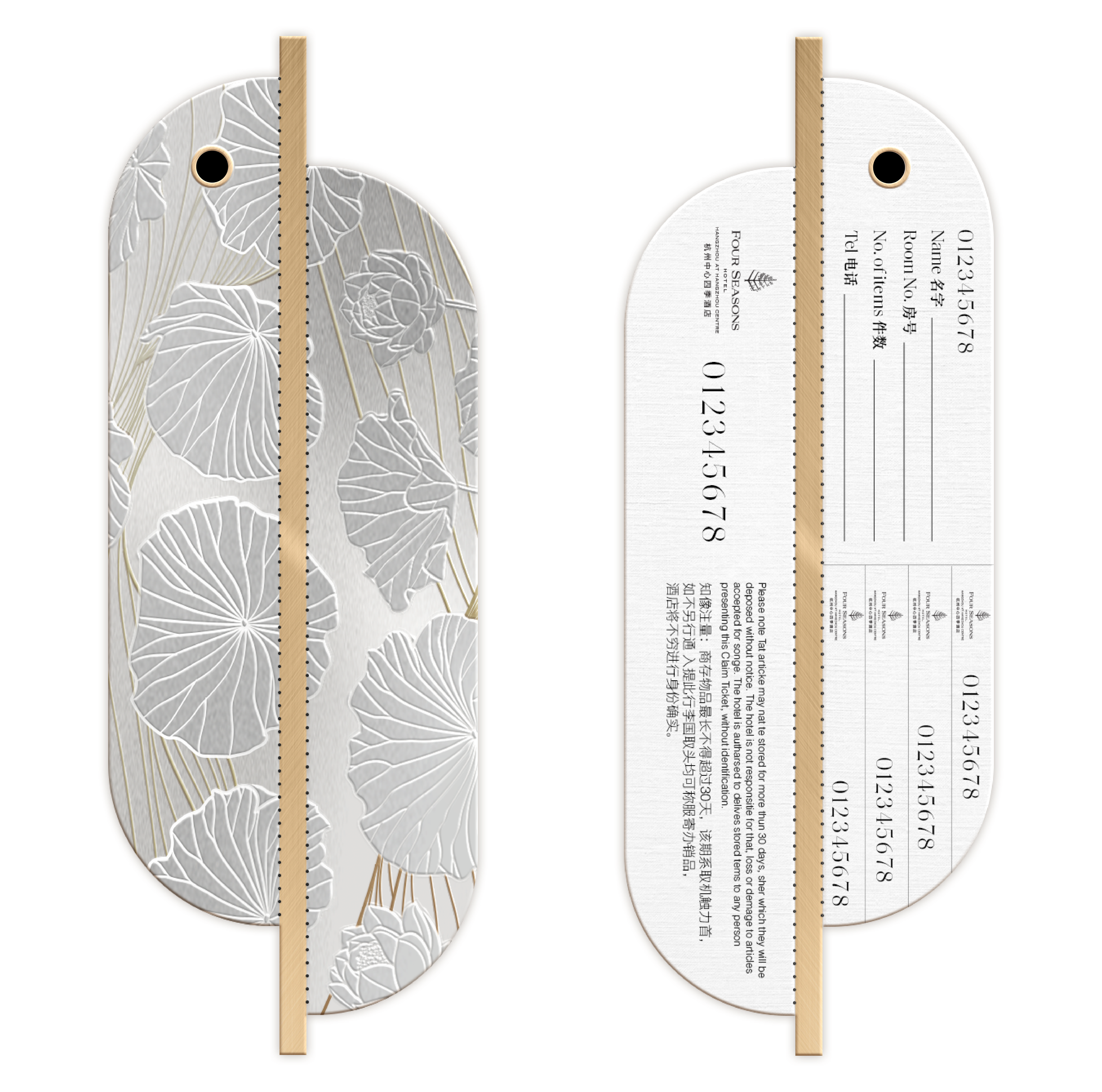
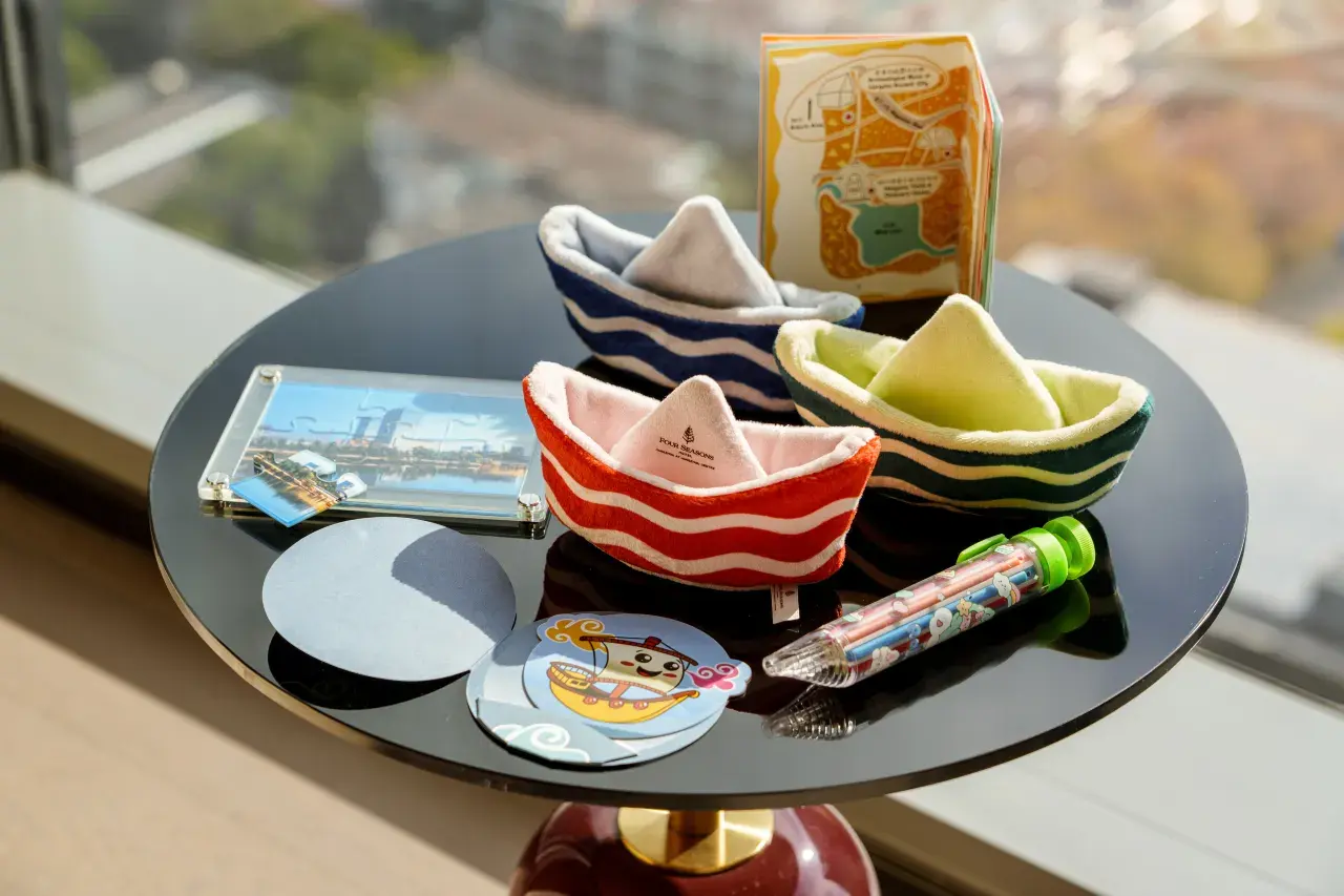
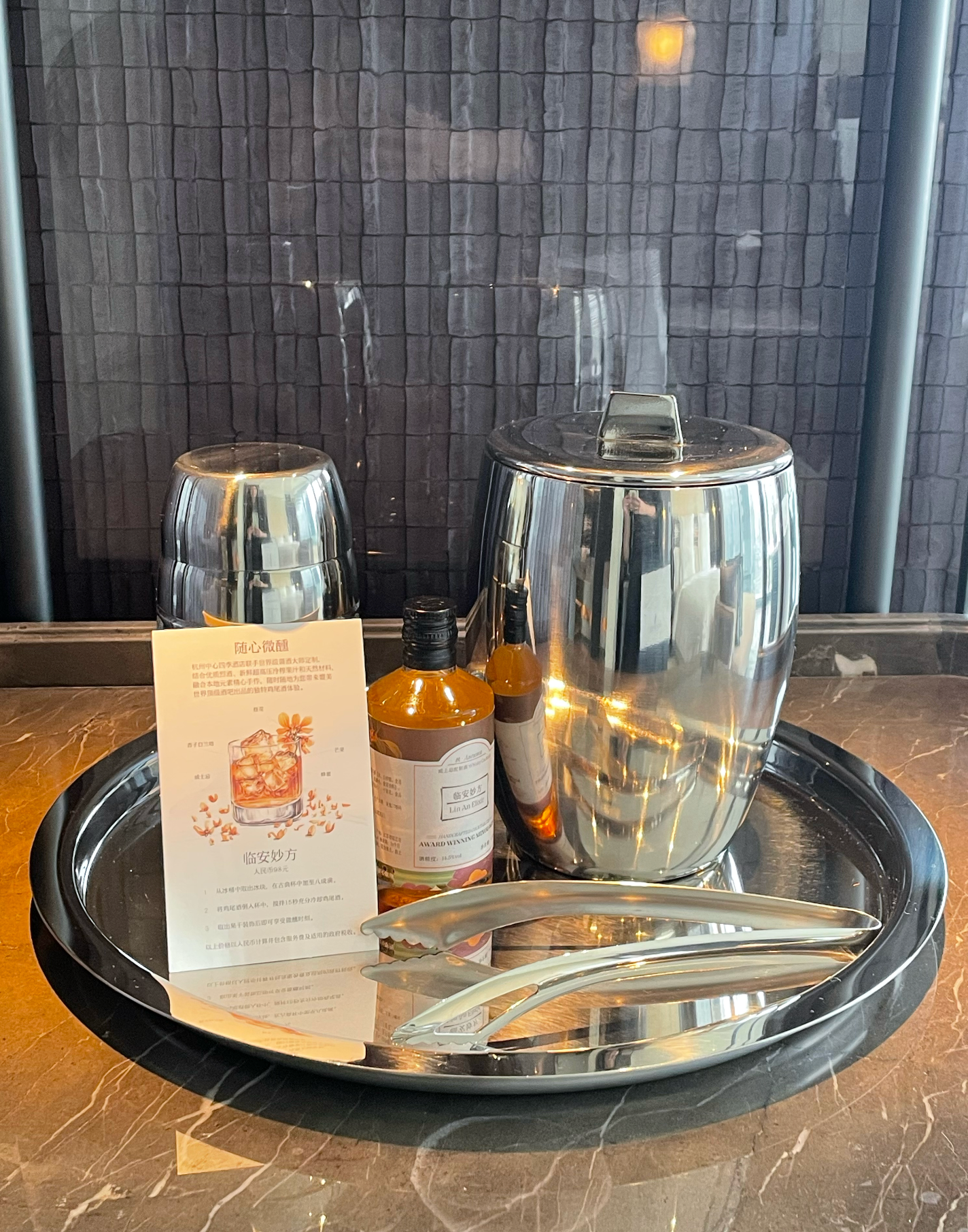
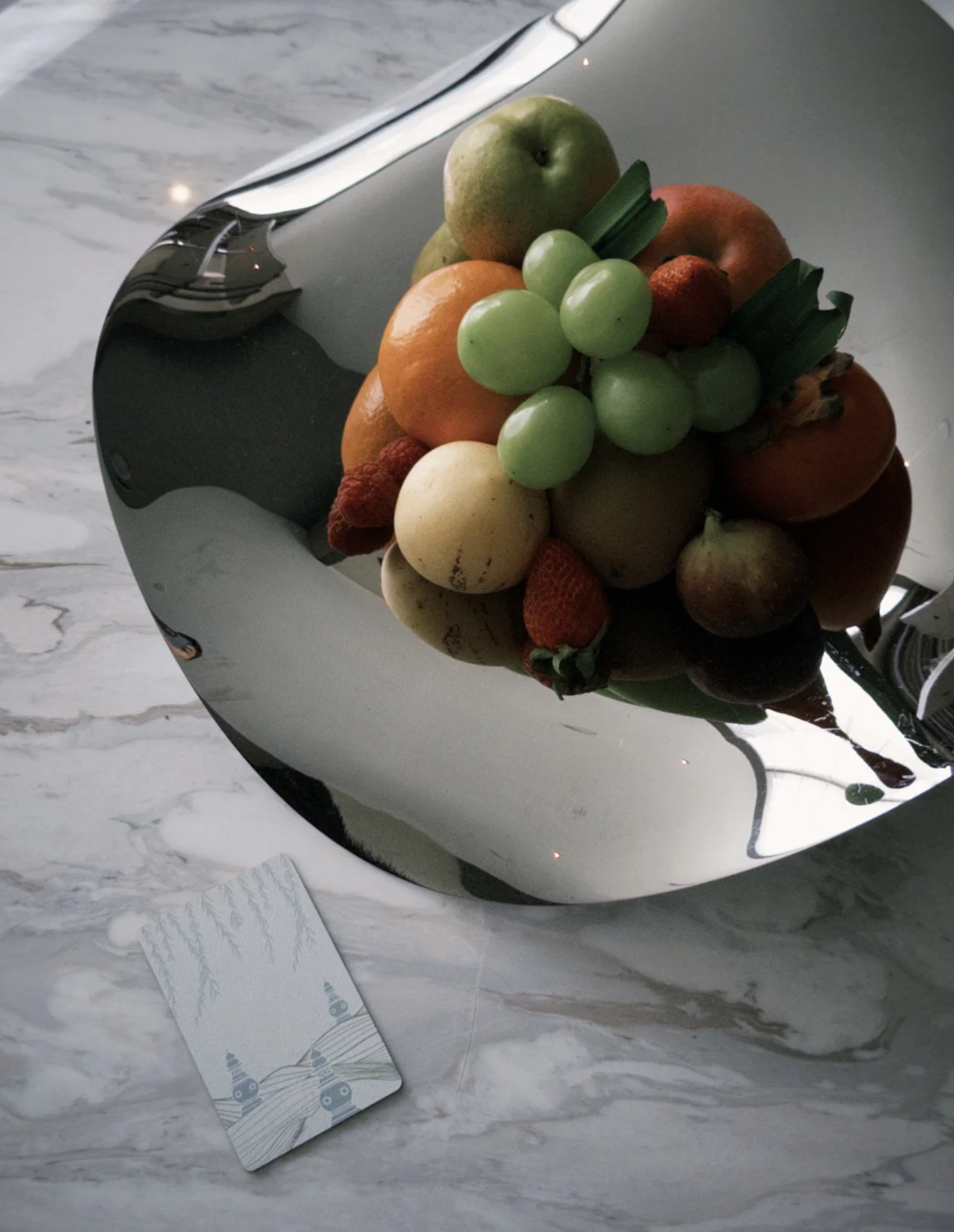
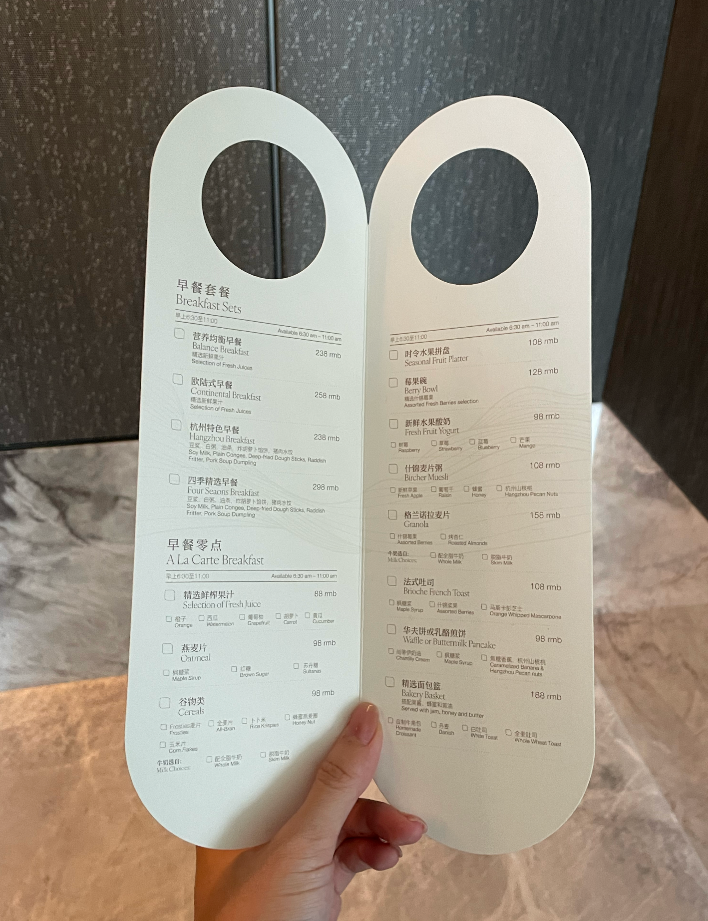
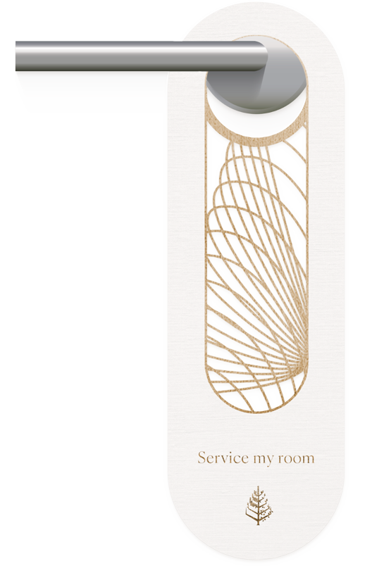
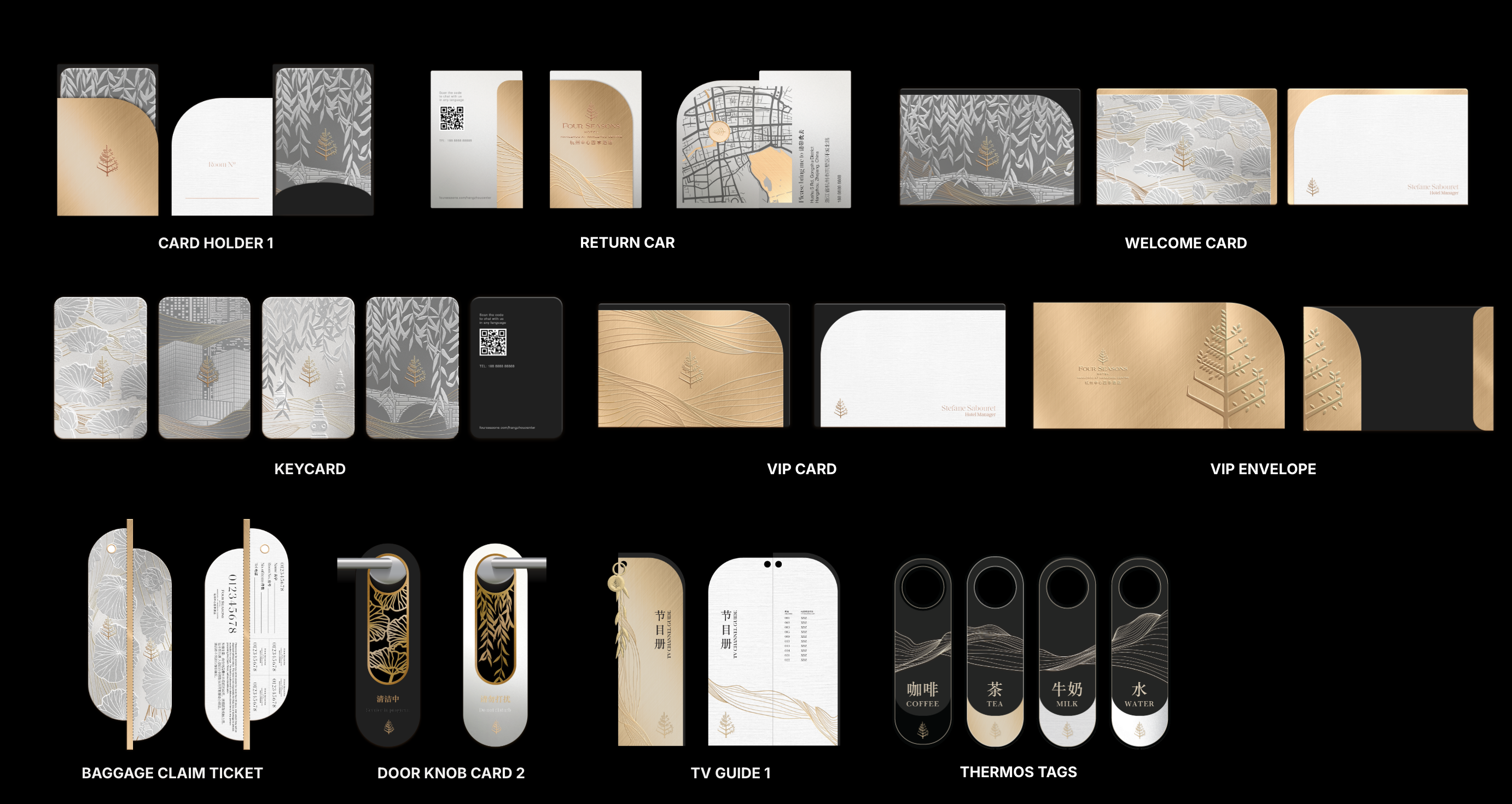
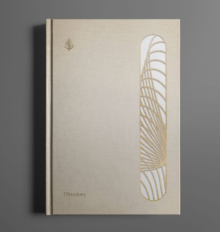
This project covers the development of a complete brand system, from defining the visual foundations to applying them across every touchpoint within the hotel. The work spans all collateral, including luggage tags, key cards, and local guide maps.
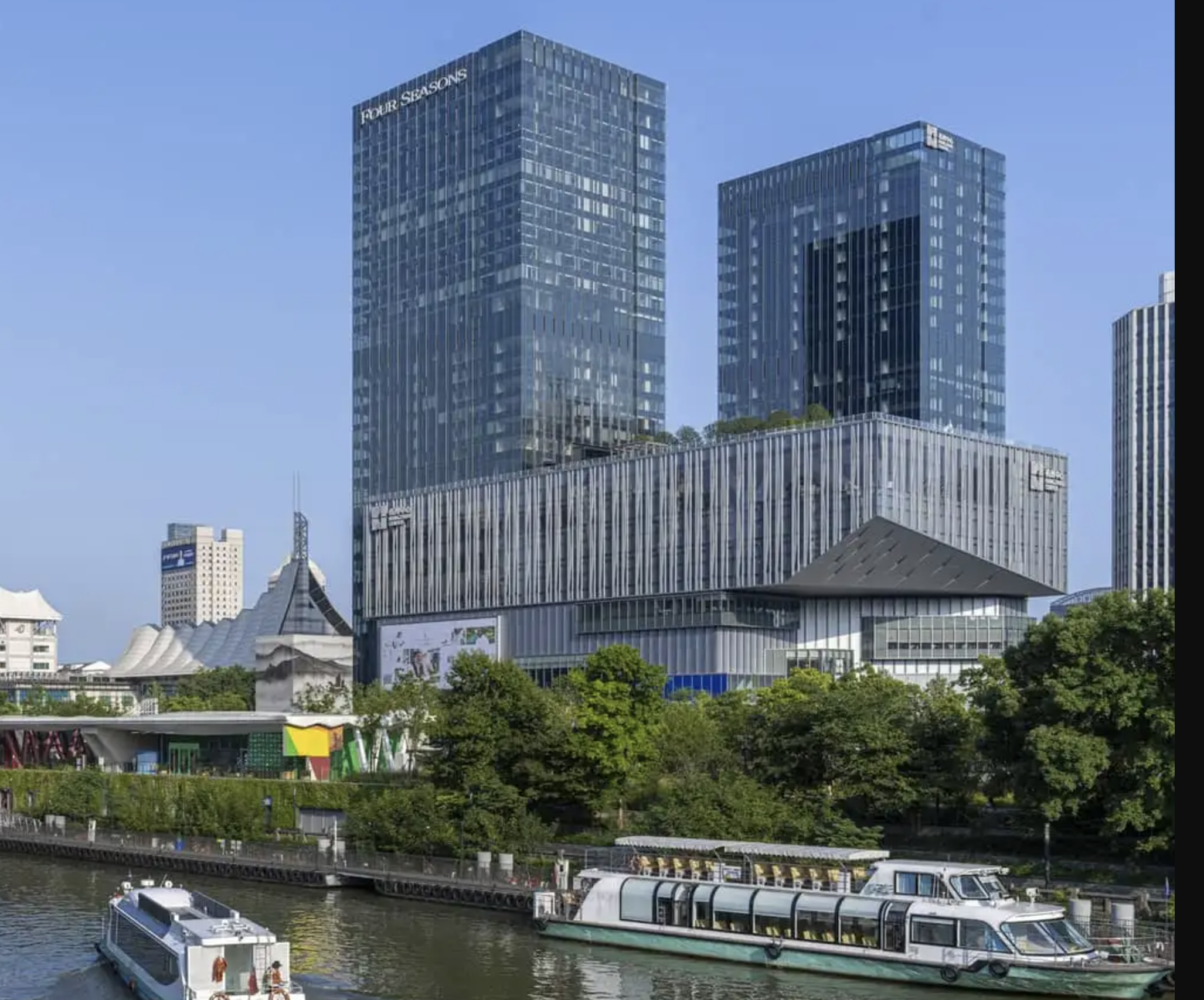
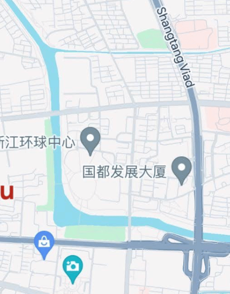
The project was commissioned for the opening of a new hotel in central Hangzhou. The brief was to clearly distinguish it from the iconic Four Seasons Hangzhou at West Lake, known for its traditional expression of West Lake beauty. The new location needed to feel rooted in the city, but lighter in tone and more contemporary in spirit.
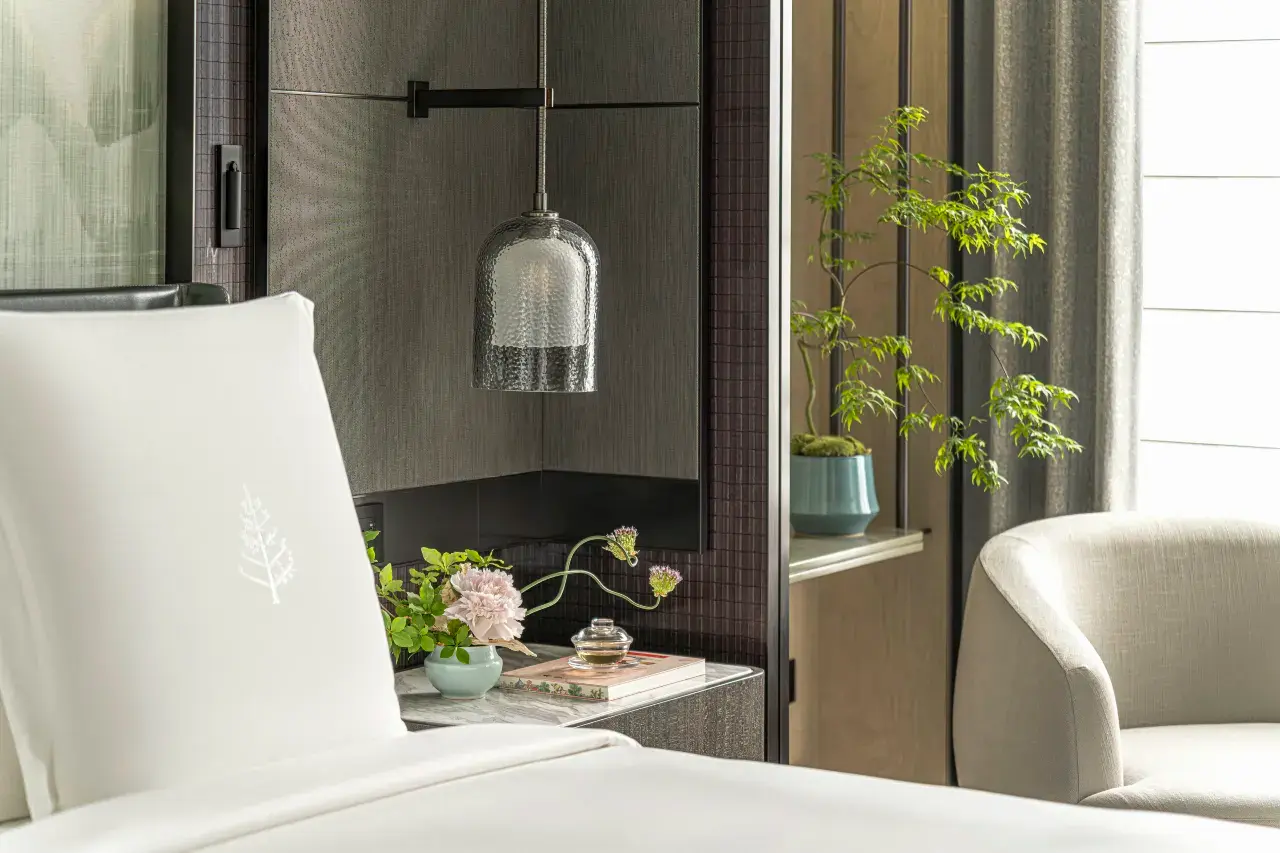
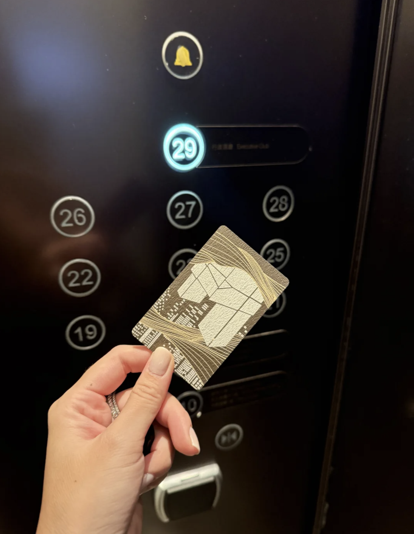
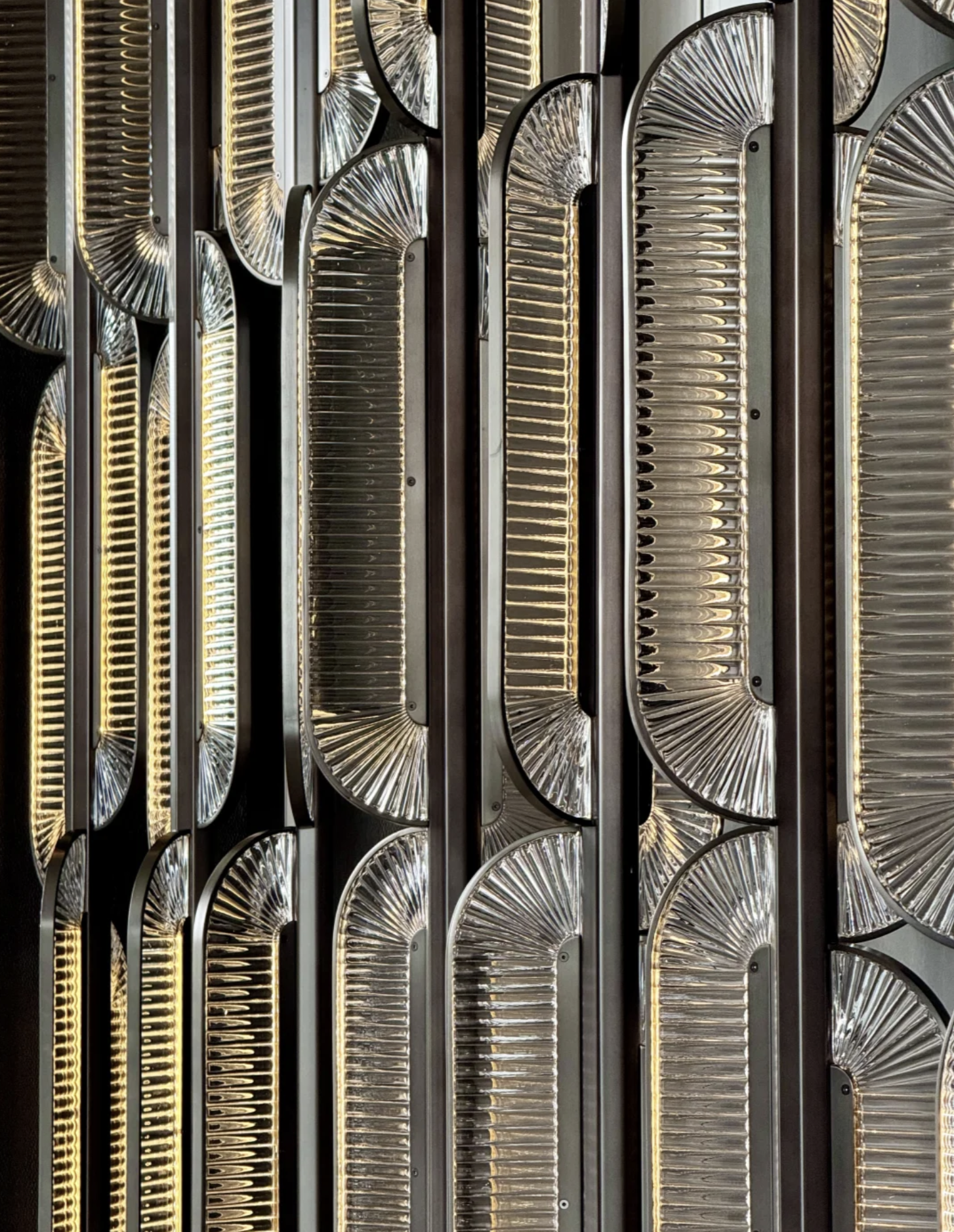
The identity draws from the cultural depth of the Grand Canal. Bridges, willow leaves, and local monuments became key references. Repeating forms found throughout the hotel architecture were abstracted and used to define the shapes of the collateral, allowing the visual language to feel native to the space.
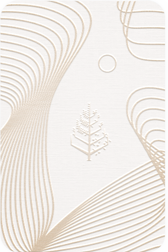
A soft, restrained palette of light beige and muted tones reflects Hangzhou’s horizon line and its year-round mist. The result is a calm, relaxed identity that mirrors the rhythm of the city and extends that sense of ease to its guests.
This project covers the development of a complete brand system, from defining the visual foundations to applying them across every touchpoint within the hotel. The work spans all collateral, including luggage tags, key cards, and local guide maps.
The project was commissioned for the opening of a new hotel in central Hangzhou. The brief was to clearly distinguish it from the iconic Four Seasons Hangzhou at West Lake, known for its traditional expression of West Lake beauty. The new location needed to feel rooted in the city, but lighter in tone and more contemporary in spirit.
The identity draws from the cultural depth of the Grand Canal. Bridges, willow leaves, and local monuments became key references. Repeating forms found throughout the hotel architecture were abstracted and used to define the shapes of the collateral, allowing the visual language to feel native to the space.
A soft, restrained palette of light beige and muted tones reflects Hangzhou’s horizon line and its year-round mist. The result is a calm, relaxed identity that mirrors the rhythm of the city and extends that sense of ease to its guests.

full doc!