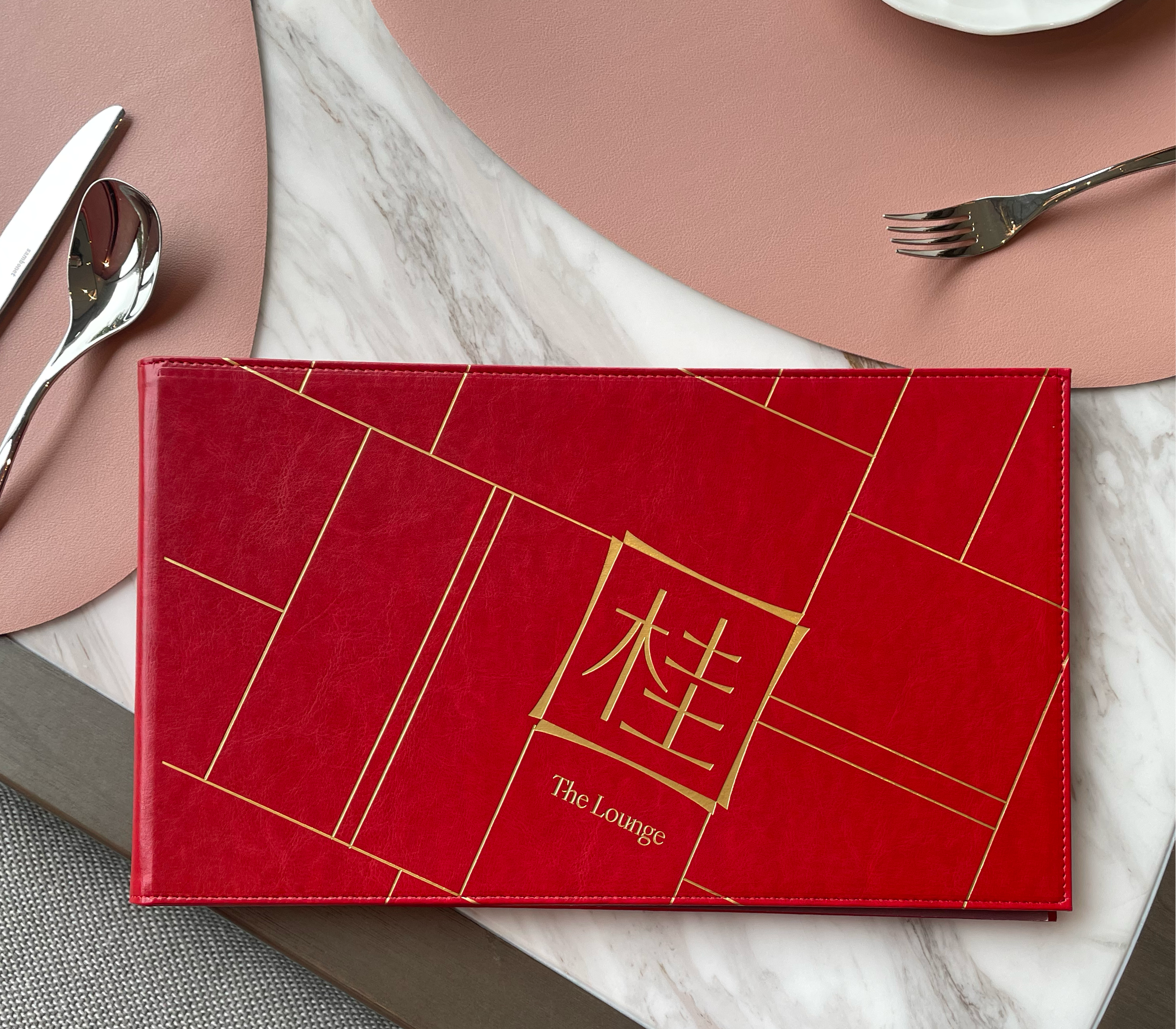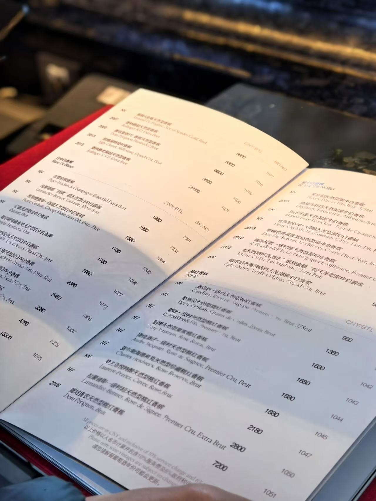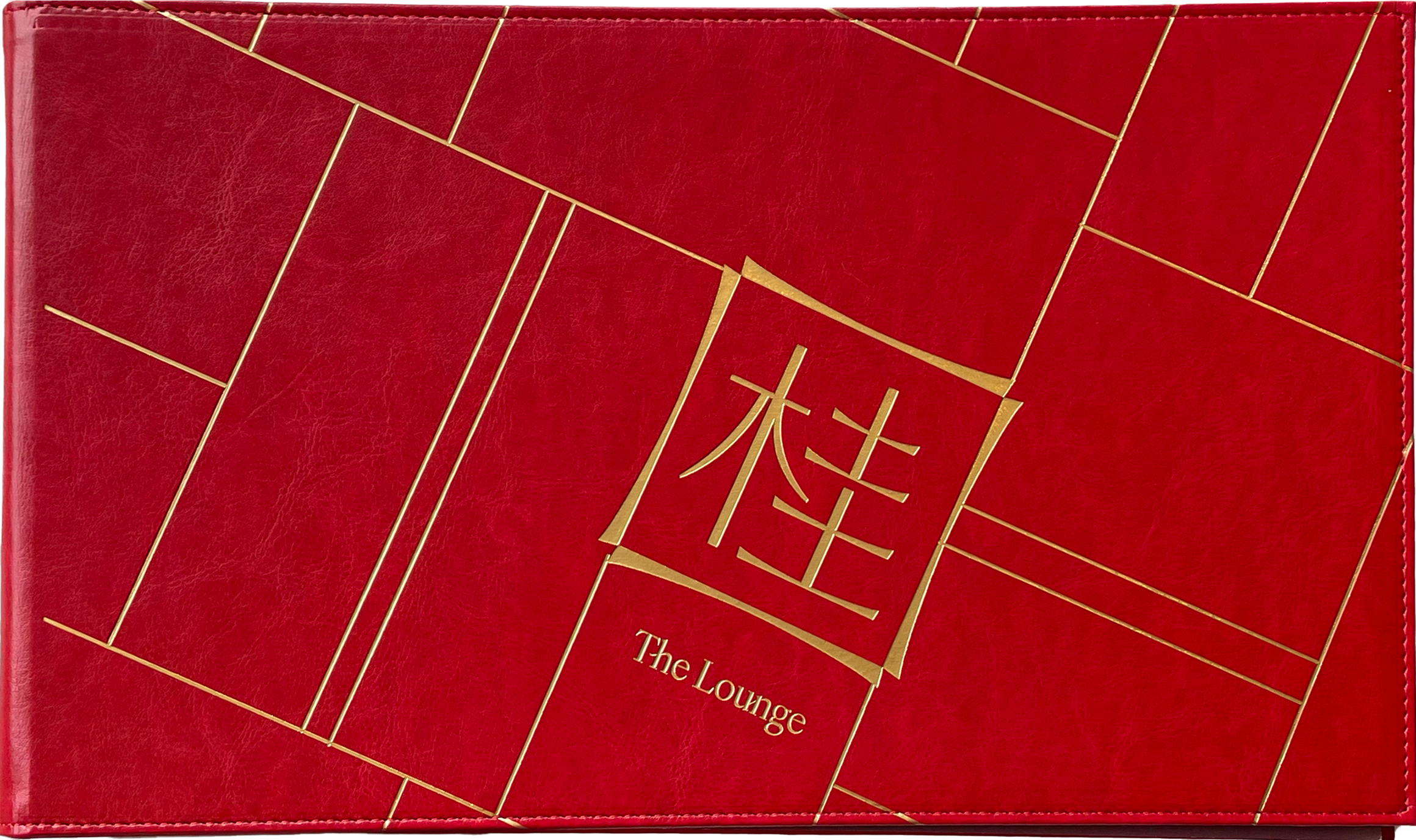
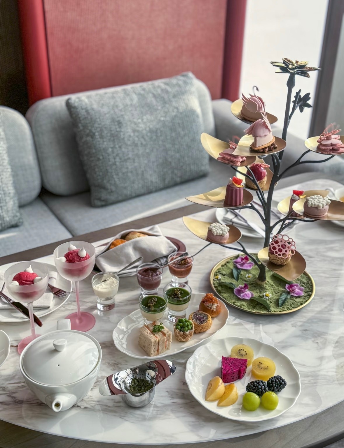


Gui is a Michelin One Star Chinese restaurant in Hangzhou. The project covered the restaurant’s naming, visual identity, and the design of all dining collateral.
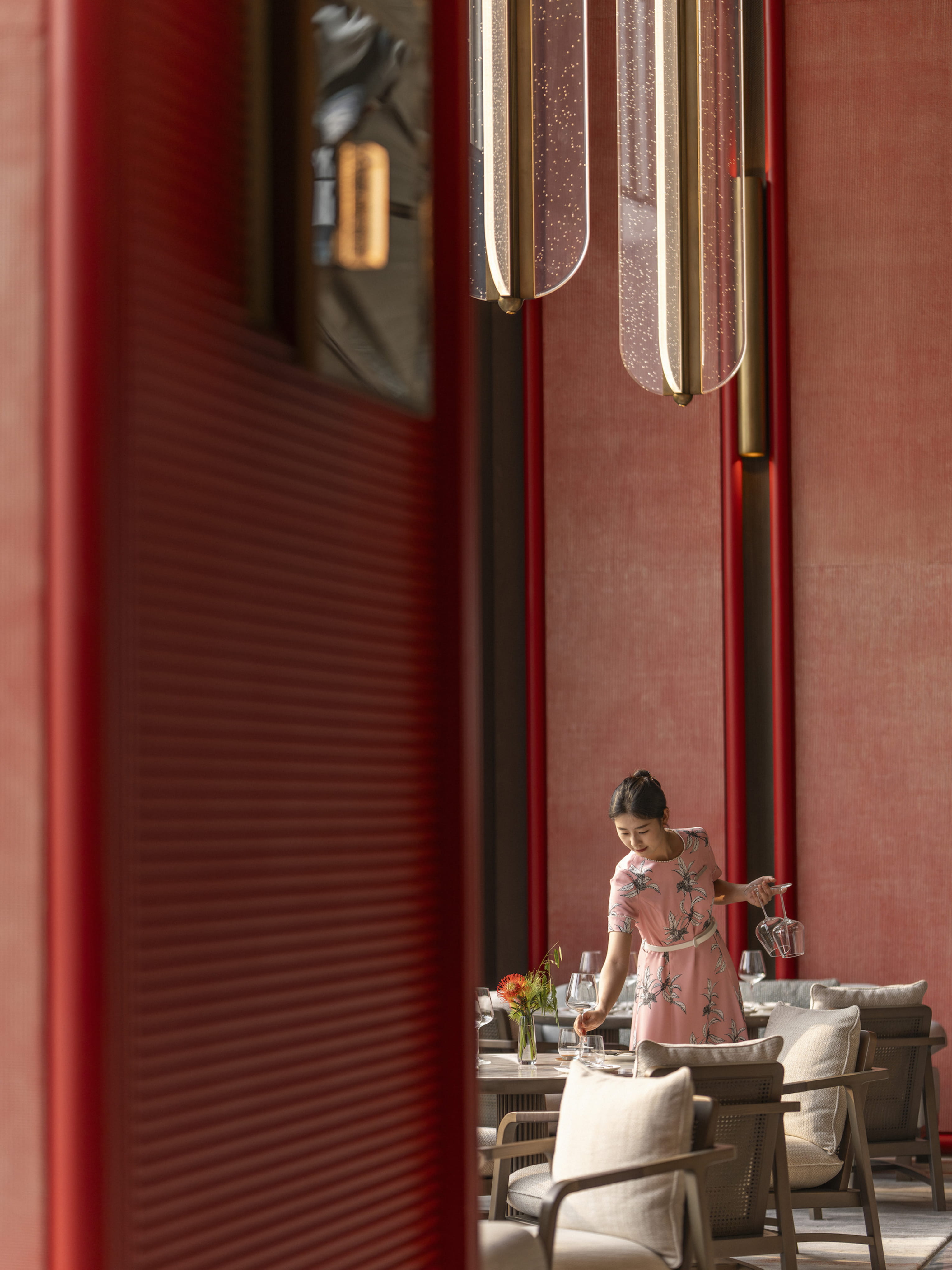
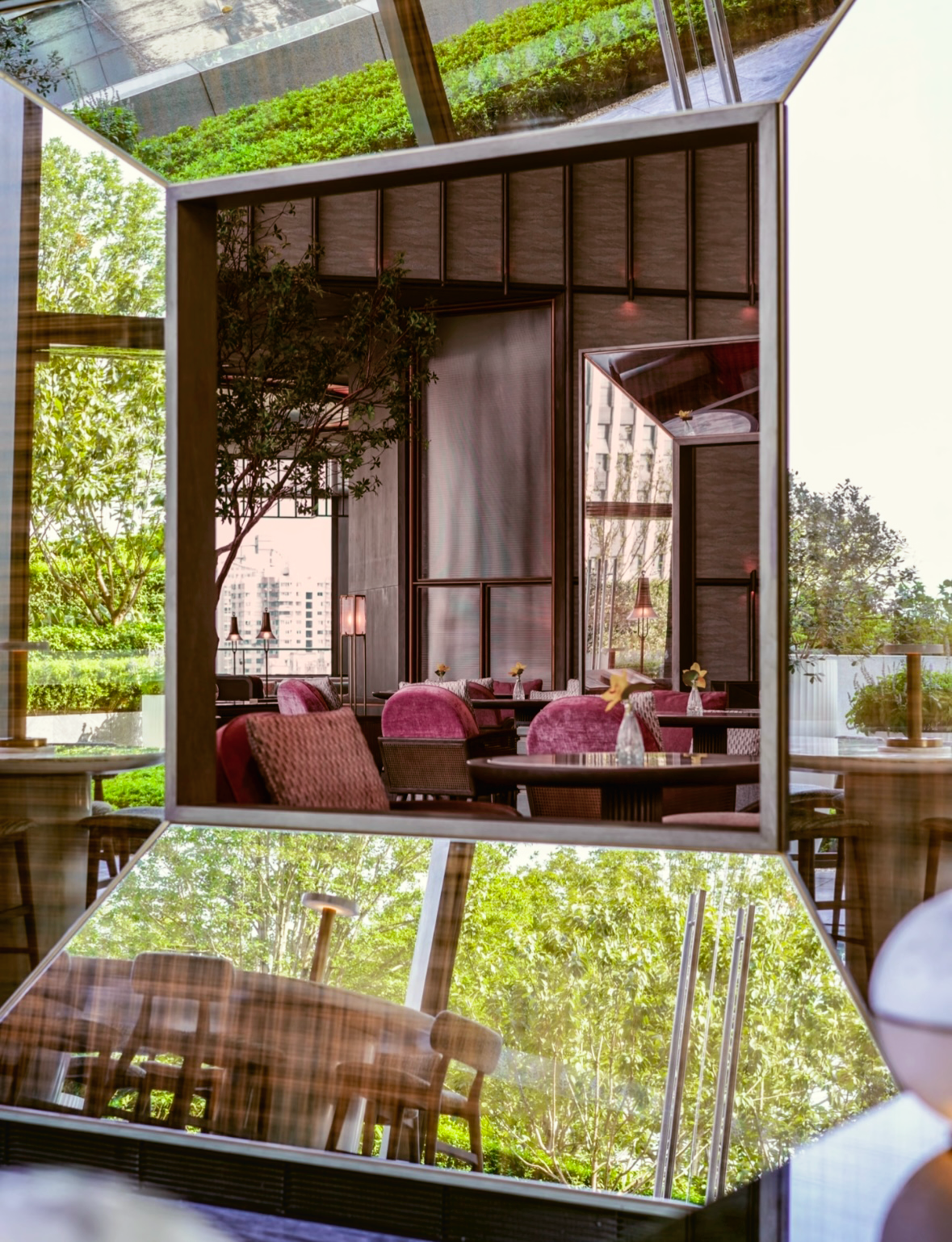
The name 桂 (Gui) comes from the osmanthus trees surrounding the open-air garden and sets the tone for the experience. The visual identity follows the space closely. Red is the dominant color throughout the restaurant, referencing both Tang dynasty aesthetics and the interiors themselves. Mirrored portals appear across the space as quiet moments of reflection and pause. These square frames, combined with locally rooted engraved printing techniques, became the foundation of the graphic system, translating the environment into a visual language that feels grounded, warm, and restrained.
